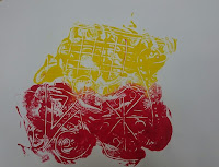
Colour
For the self led project I have decided to choose my theme as colour because I have always been interested in colour and what different things you can do with colour. My main idea is to look at which colours work well together and which colours don't work well together. To start this off I wanted to look into doing lino printing but i didn't have the materials to do it at that time so i looked at other ways i could do printing instead.
Artists
John Banting
http://www.tate.org.uk/art/artists/john-banting-691
I decided to look at Bantings work because I find his patterns really interesting and similar to the kind of patterns I want to make. Some of his work is really simple like this one but others are more detailed. For now i want to look at simple patterns to try and figure out a pattern on what to do for the final outcome. I also like the way Banting uses colour for example in this print he has used two colours, red and yellow that go together. This will give me ideas on what colours to experement that go well together.
Josef Albers
http://www.tate.org.uk/art/artists/josef-albers-636
The reason i chose to look at Josef Albers was because of the way his work looks abstract, I tried to do an experement that links with his work by painting a similar square pattern on one half of a piece of paper and then folding the paper in half to create and different type of print. All the colours he puts into each sqaure work very well with each other, which again helps me decide what colours i want to use in my work.
Andy Warhol
http://www.biography.com/people/andy-warhol-9523875
I chose to look at Andy Warhols work because of the colours he uses, they are very bright colours and colours that don't particularly work well together. After looking at Warhols work I am going to look at background colours as well as colours of the prints I am going to make.
At first i started off by experimenting scraffito by painting a thick layer of paint on piece of paper and scratching patterns into the paint using the end of a paintbrush. This was a really fun experiment to do and I found the outcomes successful. At first i decided to start on paper to see how it would turn out, eventually moving onto experimenting with fabrics. After doing this I had an idea of what colours go well together and what colours don't.
 |
| First experiment |
 |
| Print from first experiment |
This was a very successful first experiment. Even though the paint and patterns didn't fully transfer onto the print I liked the outcome and decided to experiment with this further.
 |
| Second experiment |
 |
| First print from second experiment |
 |
| Second print from second experiment |
For the second experiment I done the same thing but changing the colours and blending them together instead of having the two seperate colours. I also created two prints realising on the second print there wasn't much paint left to print from.
 |
| Experiment on tights |
 |
| Third experiment |
The next experiment i tried out was again doing scraffito but this time printing it onto fabric, i used a pair of tights. I really enjoyed the outcome of this, starting off with using white paint. I then experimented with yellow paint, finding out that the white over the black background worked well whereas the yellow over the black background didn't work at all, making it look 'messy'.
 |
| Experimenting with printing string |
 |
| Print with string |
I decided to move away from the scraffito and use different materials to print with, like stamping. My first material experimenting with was string by sticking the string to a piece of paper, painting over the top of it and then placing another piece of paper on top, creating a print. The outcome didn't come out as i expected it to but I found it weirdly successful and was pleased. I like the fact that not all of the pattern printed out and there are gaps in the lines, this could be because I printed on top of a crumpled piece of paper so the crumples stopped the paint from printing in particular places.
 |
| Feather experiment |
The next material i used to print was a feather. I painted the paint onto the feather and then printed it onto paper. I found this interesting because not all the detail came out onto the paper, I also found that applying paint to the feather distorted the shape of the feather and the strands stuck together. The print looked very plain when it was just one colour so I thought this was my chance to experiment using differnt colours on top of each other to see if it would work well. For me i thought this was so successful and i prefer having lots of colours together rather than just one placed by itself.
 |
| Cardboard prints |
 |
| Cardboard experiment |
My next experiment was to use carboard, as a result of not having lino yet, I thought it would be interesting to make a stencil out of something else, that being cardboard. I was really happy that i could use other materials while waiting for other things to be sorted and i was pleased with the pattern i made in the cardboard. Then things didn't go to plan, I applied paint to the cardboard and printed it onto some paper and it did not come out successful at all. You could barely see the pattern I had created, thinking I just didn't apply enough paint I tried another experiment again but with more paint. Again this was unsuccessful and I didn't want to carry on doing this.
 |
| Folding experiment |
The next experiment i tested was to apply paint to one side of the paper and then fold the paper in half to print on the other side. I got the pattern inspiration from Albers work, using his use of squares. I liked how the original partern changed and spreaded out, creating a mirrored image.
 |
| Experimental prints |
 |
| Experimental prints |
My next experiments was to apply different prints together, kind of like collaging them together. I decided to go back to fabric because i think that they looked more interesting and the texture is different, making the prints playable.
 |
| Prints on a canvas |
My aim was to experiment as much as possible and as it was coming closer to our crit exhibition week I needed to create a piece that would be shown. My immediate reaction was to try canvas because it's a well known thing to show on in an exhibition. I made this piece, creating different patterns and printing them next to each other or on top to still create that collage effect.


Comments
Post a Comment